


Standing out in search results gets tougher every year, especially when your blog is competing for attention and backlinks.
I’ve seen how even well-written posts can get buried if they lack visual appeal or technical optimisation. Many bloggers struggle to turn their content into something both readers and search engines want to share.
That’s where SEO-focused infographics come in. In this article, I’ll break down what sets these graphics apart, how they’re engineered for rankings, and why they consistently outperform plain text or generic visuals.
You’ll get practical steps for creating, optimising, and measuring infographics that drive real SEO gains. I’ll also cover common mistakes, placement strategies, and the best tools for design, automation, and analytics—so you can see measurable improvements in traffic, engagement, and authority.
What is an SEO infographic and why does it matter?
SEO infographics are fast becoming a go-to resource for bloggers and content marketers who want to make waves in search engine rankings. In a blogosphere that feels more crowded by the day, standing out isn’t just about what you say—it's how you say it and how well you capture interest.
SEO infographics sit right at this intersection, combining visual intrigue, sharp technical optimisation, and a knack for drawing both human and algorithmic attention.
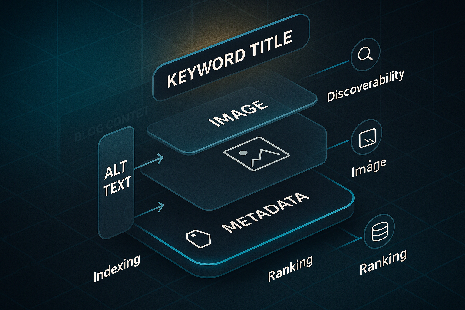
What is an SEO infographic?
Think of an SEO infographic as a strategy-driven visual—it’s not just about pretty design, but about getting your content to the top of Google’s results.
These graphics are intentionally built to power up SEO. That means they go beyond simple storytelling or brand awareness; their structure is thoughtfully engineered with keyword-rich titles, stellar alt text, and on-point metadata.
But what’s the point of all that detail?
Well, each infographic is embedded within quality blog content, adding context and cues that search engines love. This lets them attract valuable backlinks, pop up in Google Images, and help sites get indexed with much greater efficiency.
According to a study by HubSpot, content with relevant images receives 94% more views than content without visuals, indicating that visual content plays a significant role in attracting attention and driving traffic.
How are SEO infographics different from regular infographics?
The essentials come down to purpose and precision. Where regular infographics might live on social feeds or in PDFs, SEO infographics are crafted for on-page search performance—each element mapped out for maximum impact.
Surprising, isn’t it?
Here’s a closer look at what makes them special:
- Keyword optimisation
SEO infographics use targeted keywords right in the filename, alt tags, and supporting copy. - Metadata and alt text
They’re described with concise, keyword-rich metadata and alt text—critical for image search SEO. - Backlink potential
Their design aims to be especially shareable, so others reference or embed them—giving you a boost in domain authority. - Strategic placement
They're carefully dropped into blog posts to increase user engagement, sending strong signals for things like time spent on page and reduced bounce rates.
Together, these features help SEO infographics make the biggest possible impact for both search engines and readers.
Why go to all this effort? The benefits of SEO-focused visuals are hard to ignore.
Why do SEO infographics matter for blogs and rankings?
You know what’s remarkable? SEO infographics consistently outperform plain-text or unoptimised visuals. Why is that?
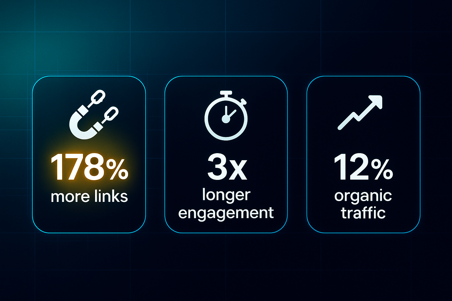
- Infographics can earn up to 178% more inbound links than regular blog content.
That’s a staggering difference! - When infographics are present, users linger over three times longer—showing how effective visuals are at holding attention.
- Just by adding infographics, sites experience an average 12% jump in organic traffic.
- Optimised images often rank highly in Google Images, opening up a whole other stream of potential visitors.
With search engines getting keener at reading visuals—and audiences demanding fresher, quicker ways to learn—SEO infographics give you a genuine competitive edge.
So if you’ve ever wondered why some blogs break through the noise, the way they use infographics might just be the answer.
Up next, we’ll unpack what actually goes into creating a solid SEO infographic and why each piece matters.
The benefits of using infographics for blog SEO
Infographics aren’t just eye-catching extras—they deliver real, measurable benefits for blog SEO. By dialling up user engagement, supercharging backlink generation, and making your content easier to find, infographics have become essential for bloggers trying to climb Google’s results in 2025.
Enhancing engagement metrics that matter for SEO
Let’s start with engagement. If you drop an infographic above the fold—within the first 600 pixels—chances are you’ll see visitors interacting with your post much sooner.
This isn’t guesswork; Orbit Media heatmaps prove early visuals drive action.
Make sure each infographic has a clear H2 or H3 heading right above it—that sets the stage for accessibility and shows Google what’s important.
You’ll want to focus each graphic on just one main idea, keep your titles sharp, and limit the on-image text to less than 80 words for clarity.
If you want to know whether your shiny new infographic actually works, tools like GA4 are your friend.
Look at your “Average Engagement Time” and “Scroll Depth” metrics before and after adding the infographic.
Segment this by traffic source and see how bounce rate shifts.
Older blog posts with at least 500 visits per month—but limp engagement? Add or refresh infographics, then track improvements with Hotjar or Microsoft Clarity heatmaps.
The uplift can be dramatic.
When updating an old post with an infographic, monitor engagement metrics like shares, likes, and comments on social media, as well as on-page metrics like time on page. Visual content is more digestible and often leads to higher user interaction.
Driving organic reach and authority
Now for reach and authority. Infographics aren’t just content—they’re link magnets.
They can pull in up to 178% more inbound links than plain articles.
Want to maximise reach?
- Submit your infographics with an “embed code”
Link back to you on directories like GrowthHackers, Infographic Journal, and Visual.ly. - Personalise your outreach and use platforms
BuzzStream or Pitchbox help you get more backlinks. - B2B infographics placement
Share on industry sites and LinkedIn. - B2C infographics placement
Get shared across Pinterest and Reddit.
Here’s where embed code generators (like Siege Media or Canva) help you track who’s sharing.
- Add share buttons
Use tools like Sumo or ShareThis. - Keep images below 35KB
They load fast and are easier to share.
Direct impact on discoverability and blog performance
Infographics also give you a lift in Google Image Search and make your blog more visible overall.
- File names under 50 characters
Helps with SEO. - Keyword-first, concise alt text under 125 characters
Optimises image discoverability.
Besides formatting, technical details like structured data can further enhance your infographic’s visibility. Structured data matters too—add schema.org/ImageObject markup via plugins (Yoast, Rank Math) and use Google’s Rich Results Test to check it all works.
- Compress with TinyPNG or Squoosh
Aim for file sizes under 75KB.
Branding consistency helps as well: keep your colours and logos in the same place, usually bottom-right or centre.
Consider using related templates across a series for repeat visitor “stickiness.”
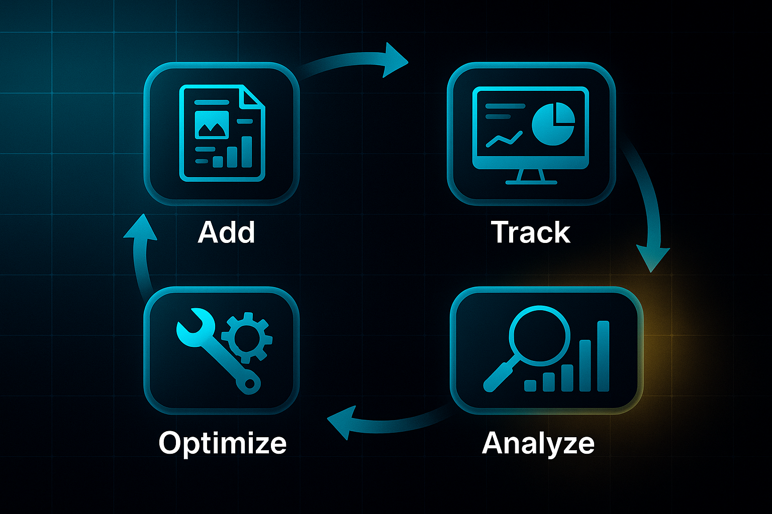
Measuring the direct SEO impact of infographics
Before you launch, get your benchmarks sorted: note down organic traffic, Search Console image impressions, average time-on-page, and backlinks.
Then, watch for changes monthly.
Custom events and UTM parameters let you trace exactly how much engagement comes directly from your infographic.
With these strategies in place, you’re ready to transform infographics into true SEO powerhouses. In the next section, we'll explore what makes a top-performing infographic and how to craft one for maximum impact.
How infographics influence content engagement and SEO signals
Measuring engagement: metrics, tools, and practical benchmarks
Wondering how to gauge the real impact of your infographics? Start by digging into Google Analytics 4 (GA4) and focus on average engagement time per session, engaged sessions, and pages per session. In 2025, the median engagement rate lands at 56%.
Once you add infographics, keep an eye out for at least a 25% lift in session duration and a bump in engagement rate by 5–10% compared to your usual numbers.
Instead of the old “bounce rate,” GA4 now pays attention to engaged sessions—meaning a user who hangs around for more than ten seconds, browses two or more pages, or completes a conversion event.
If you want to get even more specific, use Microsoft Clarity or Hotjar to track scroll depth.
Aim for a 70%+ scroll completion rate on posts packed with infographics.
Placement and technical setup to strengthen SEO signals
For your infographic to truly move the needle, placement and setup matter. Pop your main infographic near the top—within the first 250 words—to draw readers in right away and boost those crucial metrics.
Get the image sizing right: 600–800px wide, and compress to under 100KB with TinyPNG or Squoosh so everything loads lightning-fast, even on mobile.
Check that your infographic works perfectly on smaller screens; this is vital for hitting Core Web Vitals (Google’s site speed and usability standards).
Top it off with concise, keyword-rich alt text, smart file names, and ImageObject schema markup (through JSON-LD).
These tweaks make your infographic easier to find in search.
Boosting shares and link acquisition
Here’s where the real magic happens—well-optimised infographics naturally encourage sharing and attract new links. Build in sharing plugins like Sumo or ShareThis for frictionless social activity.
Add an easy embed code (Canva or custom HTML work well) to make both sharing and attribution simple.
Submit infographics to Visual.ly or GrowthHackers, and aim to land two or three quality backlinks within the first 90 days.
Infographics are still outperforming standard blog posts—pulling in up to 178% more links.
Proving ROI: tracking infographic-driven SEO gains
Don’t just hope for results—prove them. Set up GA4 event tracking for infographic engagement and add unique UTM links on all shares and embeds.
Pull the data into GA4 or Looker Studio dashboards to view trends in engagement, organic traffic, and backlink growth before and after your infographic launch.
These steps show exactly how infographics strengthen your blog’s SEO and reader engagement. And once you see the gains, you’ll be ready to design even more results-focused infographics for your next campaign.
Key steps for creating an effective SEO infographic
Having a solid, repeatable process is your secret weapon when you want SEO infographics that genuinely boost rankings, drive engagement, and attract backlinks.
Let’s break down a hands-on workflow that covers everything—from picking topics to tracking performance—while demystifying any essential terms along the way.
Strategic planning: topic and SERP analysis
Every standout infographic begins with smart research. Start by diving into keyword research with tools like SEMrush, Ahrefs, or Google Keyword Planner to uncover high-traffic topics.
Don’t just chase volume—snoop around the SERP (Search Engine Results Page) for your focus queries. Are there featured snippets or image packs where an infographic could shine? That’s your opening.
Want more shares? Use unique data—think surveys, original research, or standout statistics from places like Statista or Pew Research.
People love infographics with fresh numbers.
Design essentials: clarity, branding, and mobile optimisation
Here’s where vision meets strategy. Build your infographic around one clear message, weaving target keywords throughout titles and section headings so both humans—and Google—know what you’re about.
A good infographic has a natural flow and guides the reader’s eye through the content. The most important information should be the most visually prominent.
A strong visual hierarchy, clean layout, and font size of at least 16px (especially on mobile) make the data easy to digest.
For shareability and reclaiming those precious links, sneak your logo or blog name onto the design, but keep it subtle.
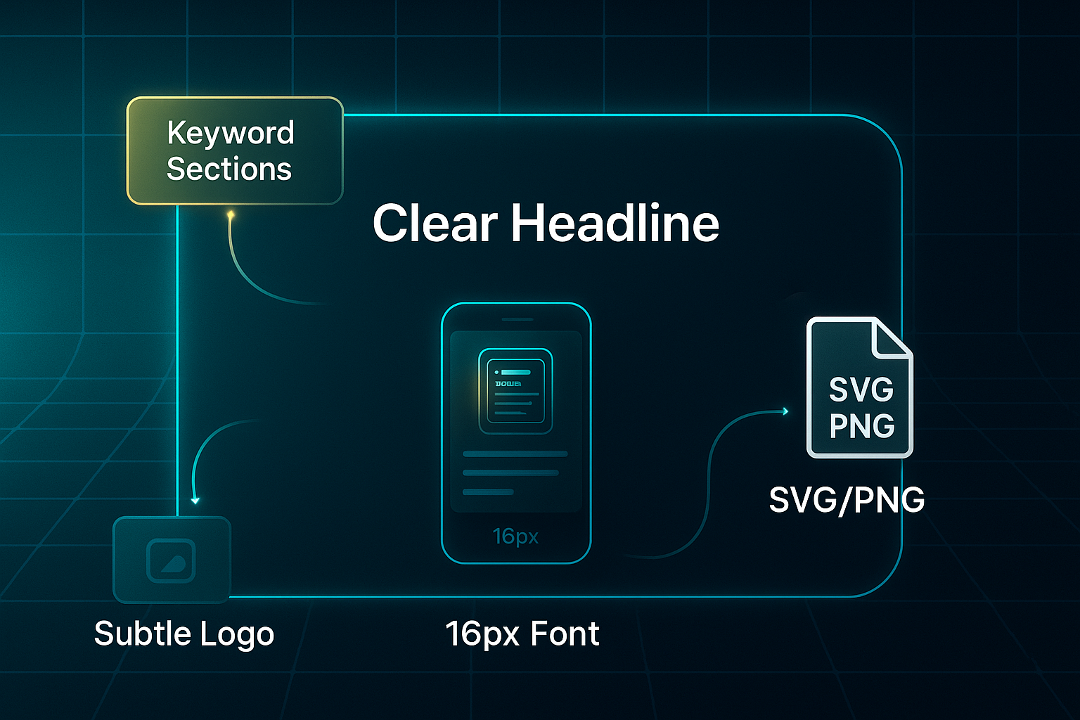
When it comes to file type, SVG and PNG are top picks. SVG gives you perfect sharpness on any device.
Compress file size under 100KB with tools like TinyPNG so your infographic loads in a heartbeat.
Technical SEO: alt text, schema markup, and metadata
Technical tweaks make a world of difference. Give your file a keyword-rich name—maybe “2025-saas-trends-infographic.png”—and craft alt text (under 125 characters) that truly describes what’s on offer and includes key data points.
Schema markup in JSON-LD, or JavaScript Object Notation for Linked Data, using ImageObject tells Google exactly what it’s seeing.
Plugins like Yoast or Rank Math can automate this, and a quick check with Google’s Rich Results Test will show if it’s working.
For interactive infographics, use ARIA (Accessible Rich Internet Applications) attributes. They make your content more navigable for users with disabilities—a must for animations or click-to-reveal stats.
When you’re working in regulated sectors, or aiming for WCAG 2.1 AA accessibility, don’t guess—ask an expert.
Measurement and analytics: linking performance to SEO
Before hitting publish, get your analytics in order. Add UTM parameters to every infographic link so you see exactly how it performs in your analytics platform.
Create custom GA4 events like ‘Infographic View’ or ‘Share’ to watch real engagement.
Record baseline stats—traffic, Search Console image impressions, and backlinks—so you know what changes.
Final checklist and compliance
Pause for a last sweep: double-check keywords, alt text, schema, image size, mobile performance, and accessibility using a tool like WAVE.
If you’re using any licensed data, cite sources and confirm copyright permissions.
And for European or global reach, GDPR and compliance aren’t optional. When in doubt, loop in a compliance or accessibility specialist.
Follow this streamlined approach, and you’ll produce SEO infographics primed for search impact, audience engagement, and measurable results.
Next up, we’ll get practical—digging into advanced technical tweaks for alt text, schema markup, mobile design, and workflow automation to truly scale your success.
How to optimise infographics for SEO
Getting your infographics optimised for SEO in 2025 isn’t just about ticking technical boxes—it’s about smart blends of precision and clear content that makes search engines smile and real visitors stick around.
The smallest tweak, from image labelling to the spot you choose for placement, can shift your rankings and ramp up engagement.
So how do you unlock the full SEO potential of your blog infographics? Let’s dive into the modern toolkit.
On-page and technical optimisation essentials
First things first: never skip alt text (alternative text). Why? It’s crucial for accessibility and tells Google exactly what your image is about.
Keep it short—under 125 characters—lead with your key phrase, and make sure it’s genuine: “SEO tips infographic showing 2025 link building and ranking methods” gets the job done.
Your file names matter too. Opt for keyword-rich, descriptive names in lowercase, separated by hyphens—think “infographic-seo-best-practices-2025.webp”. It may sound finicky, but Google looks for thoughtful, search-friendly filenames over generic ones.
Let’s talk load speed.
If your infographic is slow, people bounce. Compress each image to under 80KB for mobile, 100KB for desktop. Tools like TinyPNG, ImageOptim, and Kraken.io keep things lean using WebP or AVIF formats—while preserving crispness.
After applying these tools, test in Google PageSpeed Insights for improvements in your Core Web Vitals (Google’s usability standards)—those scores really do matter.
Responsive images are a must these days.
Use “srcset” in your HTML to supply at least three different sizes—say 400w, 800w, and 1200w—to fit every device. Always specify width and height so your layout doesn’t jump around.
That way, readers get clear visuals whether they’re on a laptop or a mobile screen.
Schema, sharing tags, and workflow automation
Now, here’s where you take things up a notch.
Add ImageObject schema markup via JSON-LD with fields like “contentUrl”, “name”, “description”, “author”, and “uploadDate”. This structured data makes your infographic visible for rich results and builds authority.
Tools like Yoast SEO, Rank Math, or advanced mapping in Schema Pro can automate a lot here. And if you need everything handled at scale, SEOSwarm can automate schema across all your posts and guarantee compliance sitewide.
Want to make your visuals pop on socials? Fill your page head with Open Graph and Twitter Card tags.
For Open Graph, use og:image, og:title, and og:description, calling up a 1200x630px infographic.
Twitter Cards should lean on “summary_large_image” and strong content tags—boosting your reach every time someone shares.
With image optimisers like ShortPixel, Smush, or Imagify, you can combine compression and smart format conversion.
For larger content teams, automation plugins tie together SEO fields, social metadata, and lazy loading—giving time back and keeping the process smooth.

AI-Powered
SEO Content Strategy
See the AI platform that's replacing entire content teams
(with better results).

Internal linking, CTAs, and accessibility
Where you place your infographic is everything.
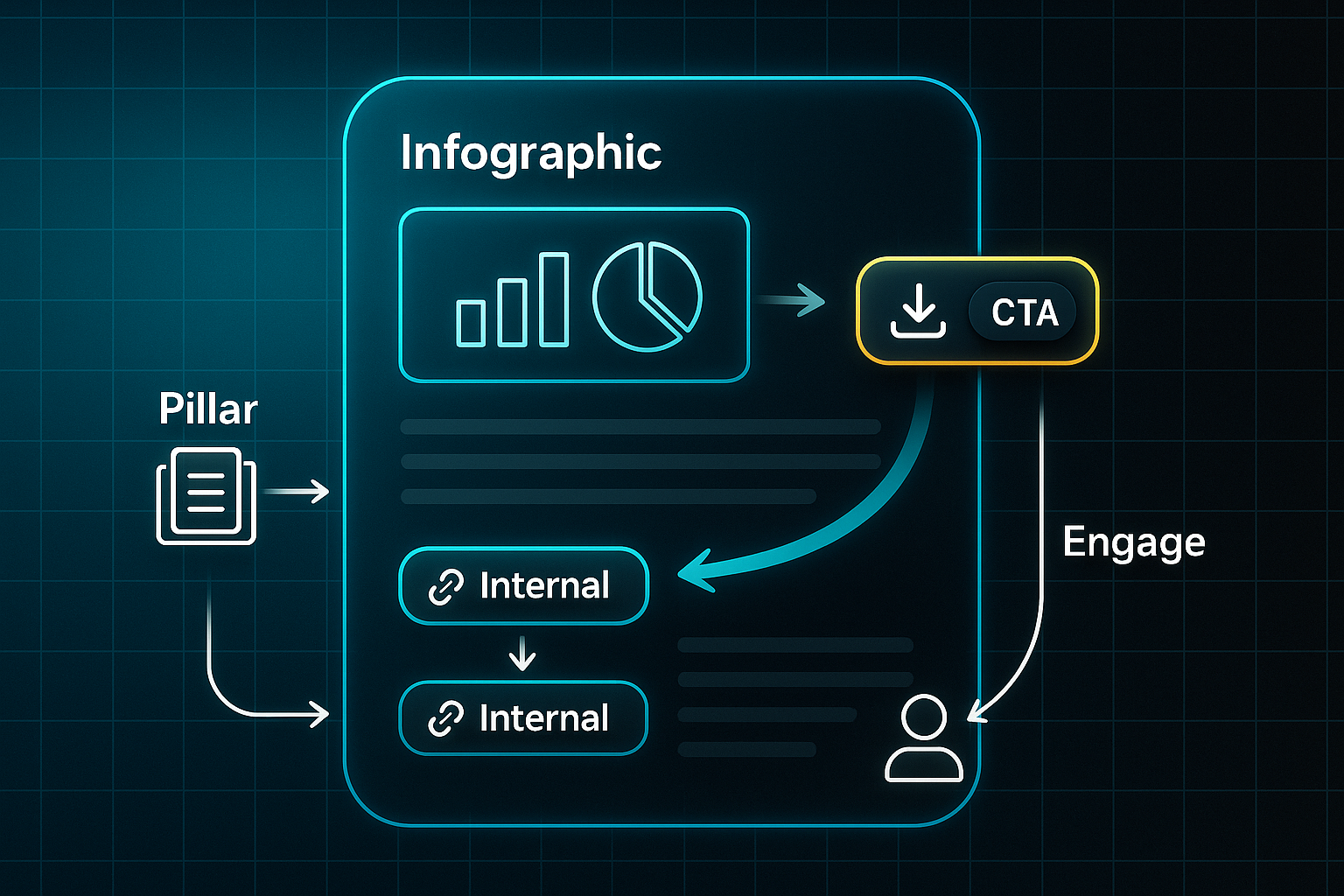
Pop it near the top of your post—above the fold, within the first 250 words—and weave it into keyword-rich copy. Then link your infographic to pillar pages or related articles to strengthen site structure.
You’ll also want visible calls-to-action right next to each infographic: maybe a download button, email sign-up, or prompt to share—this ramps up measurable engagement.
As for accessibility, combine meaningful alt text, clear image labels, high-contrast colours, and large, readable fonts.
If your visuals are interactive, go the extra mile: provide a full text transcript or a simplified HTML alternative. Tools like WAVE and Axe DevTools make it easy to check you’re hitting WCAG 2.2 compliance.
Put together, these technical and content steps mean your infographics will drive faster indexing, higher rankings, and real audience engagement.
Ready for more impact? The next section explores smart placement strategies to squeeze even greater value from every visual you publish.
Infographic placement in blogs for maximum SEO impact
Getting your infographic placement and technical setup spot on turns visuals into SEO assets that truly make a difference.
Whether you’ve got a sprawling content site or just a handful of high-value pages, a structured approach helps every infographic pull its weight for rankings and audience engagement.
Above-the-fold and prioritisation strategies
Think of placement as a step-by-step process—start at the top and use data to maximise your reach.
Here’s how to focus your efforts for the highest impact:
- Place above the fold
Embed infographics within the first 250–300 words, or top 600–800px on desktop (400–600px on mobile), so visitors see them right away. Check with Google Mobile-Friendly Test or BrowserStack to ensure they display properly. - Prioritise pillar pages
Tools like SEMrush or Ahrefs help you identify the blog’s most valuable topics. Start with your top 3–5 keyword-ranking pages, or for smaller blogs, add infographics to every pillar and monitor scroll depth to track gains.
Technical setup for scalable, unique embedding
Getting the technical setup right keeps your infographics quick to load and optimised for search. It also helps avoid any duplicate content traps.
To ensure your infographics are truly scalable and unique, focus on these details:
- Responsive setup
Use srcset in HTML for 400w, 800w, and 1200w sizes, keeping files below 100KB for rapid, crisp rendering everywhere. - Unique alt text and filenames
Write descriptive, keyword-focused alt text (under 125 characters) and a SEO-friendly filename for each infographic placement. - Canonical tags for the primary page
When using the same infographic in multiple posts, set a canonical tag on your pillar, so search engines consolidate ranking authority.
Outcome tracking for placement optimisation
Measuring results is what separates guesswork from actual growth. Proper analytics show where your infographic strategy succeeds and where it needs a tweak.
To track performance and steer improvements:
- Monitor results in GA4 or Hotjar
Check scroll depth and engagement for 2–4 weeks after embedding to pinpoint true uplift. - Typical uplift
In practice, above-the-fold infographics often increase session duration and organic traffic on pillar pages.
When you combine smart placement, technical precision, and close review, infographics become your SEO secret weapon.
Next, we’ll look at common mistakes so you keep steady growth.
Common SEO infographic mistakes (and how to fix them fast)
It’s easy to get swept up in designing an eye-catching infographic and forget about the little details that actually matter for SEO. The truth is, missing these essentials can cost you big—especially now in 2025, with tougher competition for engagement, rankings, and valuable link-building opportunities.
Top SEO infographic mistakes to avoid
Before you hit publish, let’s walk through the five common hiccups that can hold your SEO infographics back—and the quick fixes for each one:
- Missing or generic alt text
55% of sites skip detailed alt tags, damaging Google Images visibility, access for all users, and your SEO. Write unique alt text (≤125 characters) using main keywords and a clear summary. - Oversized or uncompressed images
Large files aren't just clunky—they slash your results. Just a 3-second delay can jack up bounce rates by 32%. Keep images compressed (WebP/AVIF, 80–100KB) and use srcset for mobile. - No schema markup or broken fields
Forgetting ImageObject schema means missing out on rich results. Add JSON-LD with name, url, description, and author fields, then validate markup. - Unresponsive designs
With 57% of traffic now on mobile, non-responsive infographics just won’t cut it. Ensure designs scale, use 16px+ fonts, and 44x44px tap targets. Test them on real devices. - Neglecting outreach or internal linking
It’s amazing how many infographics go unnoticed because there’s no promotion. Build an outreach plan and always include internal links to strengthen authority.
Spotting and fixing these issues gets easier with the right tools: Screaming Frog finds missing alt text, PageSpeed Insights checks load speed, and Google’s Rich Results Test flags schema problems.
Sort these out early on, benchmark against top SERPs, and revisit your process each month to keep infographics performing at their best. And if you’re ready to really make your visuals pop, up next are the advanced outreach and promotion strategies that put infographics on the map.
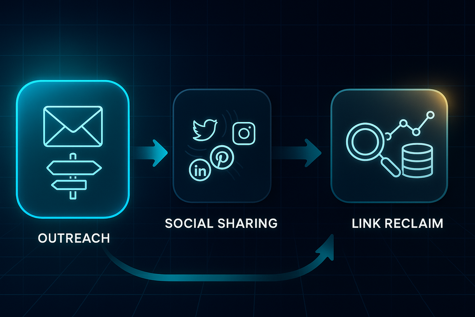
Promoting Infographics for SEO: Outreach and Link Building
If you want your SEO infographic to do more than just sit pretty, you need a plan to get it noticed.
Promotion is what transforms a simple visual into an SEO ranking powerhouse and a genuine link magnet.
In 2025, the go-to formula is a blend of smart outreach, directory posts, strategic embedding, social media buzz, and robust link recovery.
Direct outreach for high-value backlinks
Start by hunting down blogs with a Domain Authority (DA) over 40.
Ahrefs and SEMrush make it easy to spot these.
When you reach out, personalise your email—mention something recent from their site and offer your infographic’s fresh data or visual twist.
Include a ready-to-share embed code (that’s a small HTML snippet for sharing, attribution baked in), and don’t forget the polite nudge—follow up in 5–7 days.
That second touch? It can bump your reply rate by 35%.
Directory submission for early links
Next, try submitting your infographic to platforms like Visual.ly, Infographic Journal, SlideShare, and InfographicBee.
Make sure your title pops with keywords, your caption is tight (less than 50 words), and the file itself comes in under 1MB.
Doing it right can help you snag 2–5 fresh referring domains every campaign.
Smart embed and attribution
Give readers an easy “Share this infographic” prompt, complete with an embed code.
Wrap schema markup (structured data for search engines) in these codes—this helps ensure every share can deliver an SEO-friendly backlink.
Social media and influencer amplification
Break your infographic into bite-sized graphics and post them on LinkedIn, Instagram, Twitter/X, and Pinterest.
Tag sources and influencers, and ride the wave of trending hashtags to expand your reach.
The real surprise in 2025? Social platforms now often deliver more earned links and referral traffic than static websites.
Link reclamation and tracking analytics
Keep tabs on who’s talking about your infographic with Google Alerts or Ahrefs.
If someone shares but skips the link, politely ask for attribution—B2B success rates are above 50% here.
Track every outreach and share using UTM codes in GA4 to see exactly which channels bring backlinks, visitors, and engagement.
For seamless campaign monitoring, SEOSwarm integrates infographic analytics, multi-channel attribution, and outreach insights in one dashboard.
With the right tools and consistent execution, promoting infographics the smart way is how you climb the SERPs and secure real SEO gains.
Ready for the next step? We’ll spotlight the top tools and platforms powering infographic campaigns in 2025.
Top tools and services for creating and optimising SEO infographics
Running a successful SEO infographic campaign in 2025 starts with the right toolkit. You’ll need platforms that handle design, image optimisation, and automation, as well as reliable analytics to track results. Picking your stack isn’t one-size-fits-all—think about speed, ease-of-use, and how deeply you want to customise every step.
Design and creation platforms
Your choice of design tool should balance speed, creative freedom, and collaboration. Templates make things quicker, but effective data integration and branding options matter even more if your content needs to stand out. Let’s see how popular platforms compare and what each is best at:
| Tool/Platform | Monthly Cost (2025) | Key Strengths | Best for |
|---|---|---|---|
| Canva | Free; Pro $12.99+ | AI and 1M+ templates, drag-and-drop, real-time editing | Quick infographics, non‑technical users |
| Piktochart | Free; Pro $29+ | AI charts, data import, SVG export | Data-rich blogs, education |
| Venngage | Free; Pro $9.99+ | 7,500+ templates, brand kits, icons/photos | Advanced branding, marketing teams |
Canva is brilliant for fast, accessible design—especially for solo bloggers and those new to infographics. Larger teams or agencies that need frequent branding tweaks often find Venngage’s options more appealing, while Piktochart stands out for educational content or infographics packed with original data.
If you prefer ease and speed, Canva’s drag-and-drop wins. For repeated campaigns with nuanced branding needs, Venngage is a strong choice. Projects with heavy statistics or data visualisation get a leg up with Piktochart’s robust chart features.
Image optimisation and schema
Sharp visuals are nothing without snappy load speeds and clean metadata. Before you pick a tool, think about bulk processing, automation, and support for formats like WebP and PNG. Below is a direct comparison to help you choose wisely for your workflow:
| Tool | Free/Paid | Unique Features | Best Case |
|---|---|---|---|
| TinyPNG/TinyJPG | Free; $9.99+ | Lossless bulk compression, WebP/PNG | Quick site-wide optimisation |
| ShortPixel | Free (100/mo); $4.99+ | WP plugin, automated batch | Easy WordPress integration |
| Schema.org Generator | Free | Simple JSON-LD for infographics | Manual schema for any CMS |
| Rank Math | Free; $59/yr | Automated image schema, Google integration | WP schema automation |
TinyPNG offers rapid, cross-platform compression—a must for anyone managing a variety of blogs. If you’re on WordPress, both ShortPixel and Rank Math can fully automate image optimisation and schema tagging, letting you focus on new content. Schema.org Generator is best for sites with manual workflows or custom integrations.
For most creators, automating image tasks saves hassle and keeps infographics under 100KB—crucial for SEO. Non-WordPress sites can use TinyPNG with Schema.org Generator to combine bulk optimisation and clear metadata, while WordPress users should consider plugging in ShortPixel and Rank Math together for a seamless set-and-forget experience.
Automation and analytics platforms
Finally, automation and analytics keep campaigns efficient and measurable. Think about all-in-one integration, multi-channel distribution, and the depth of insights you want, then compare the main players below:
| Platform | Price | Workflow Strengths | Best for |
|---|---|---|---|
| SEOSwarm | Custom | blog, infographic, schema, analytics automation | All-in-one, non-technical users |
| Zapier | Free; $19.99+ | Connects apps, automates sharing | Manual stacks, multi-channel |
| Google Analytics 4 | Free | Engagement, events, conversions | Blog performance tracking |
| Hotjar | Free; $39+ | Heatmaps, feedback, UX optimisation | Infographic placement review |
SEOSwarm is ideal if you want your stack managed from start to finish: blog creation, infographic insertion, and analytics, all in one click—for anyone wishing to skip plugins or code. Zapier suits those comfortable with manual connections or more hands-on automation.
Google Analytics 4 and Hotjar give clear engagement metrics, show which infographics work, and help you test different placements to optimise user experience.
A workflow matched to your tech comfort unlocks better rankings and saves time—so choose a combination that lets you focus on creativity, measure true results, and scale with confidence.
Blog-in-one-minute
Add a fully SEO-optimised blog to your website with just 2 lines of code.
Learn more
Measuring the SEO impact of infographics
Tracking the real SEO impact of your infographics is all about following the right metrics and using tools that bring those numbers to life. If you want results you can act on, focus on engagement, organic visibility, backlinks, and whether you’re seeing any technical SEO improvements.
Key metrics and best practices
When it comes to knowing what’s working, these are the metrics that matter most. Here’s what you should be checking—and what strong performance actually looks like:
- User engagement
Measure average session duration and scroll depth using Google Analytics 4 (GA4). Engaging infographics usually boost time on page by 20% or more and push scroll depth above 70%. - Organic traffic and impressions
Compare your pageviews and search impressions in GA4 and Google Search Console, both before and after uploading your infographic. A 10–20% rise in organic traffic during the first month is a strong signal you’re on the right track. - Keyword position and CTR
Use Google Search Console or Semrush to keep an eye on your keyword rankings and click-through rates. Well-optimised visuals can lead to a one-position jump and a 5–15% boost in CTR. - Backlink growth
Check for new linking domains in tools like Ahrefs or Moz. With truly effective infographics, expect 2–5 new referring domains within a few months. - Schema and Core Web Vitals
Run Google’s Rich Results Test to confirm ImageObject schema is set up, and make sure optimised images hit the Core Web Vitals LCP target of under 2.5 seconds.
Bringing these metrics together, run a quarterly report that combines engagement, search, and link data side by side. Looker Studio is excellent for visualising these trends.
If you notice things stalling—whether engagement, links, or rankings—review your design, schema, and outreach process, then refine and test again. You can automate both analytics and technical tasks with SEOSwarm, letting you scale up without extra busywork. By leaning into these practical benchmarks, you’ll quickly spot which visuals are moving your SEO forward—and know exactly where it pays to double down.
Advanced strategies and technical SEO tips for infographics
If you really want your SEO infographics to leave a lasting mark in 2025, it’s time to step up from the basics. True success now means weaving in technical innovation, detailed analytics, and a relentless focus on optimisation.
Ready to take things further? Here’s how to play at the advanced level—where interactive HTML, accessibility, structured data, testing, and powerful automation unlock the big wins.
Interactive infographics and accessibility compliance
Forget the old habit of just dropping in static images.
Build your interactive infographics directly in semantic HTML or SVG (Scalable Vector Graphics—a format that keeps images sharp and animates easily).
Tag every element with properly descriptive alt text, and use ARIA labels (Accessible Rich Internet Applications—attributes so screen readers know what’s happening) to give everyone a smooth experience.
Serious about accessibility? Keep to WCAG 2.2 standards: at least 4.5:1 colour contrast, a minimum of 16px for font size, and tap targets no smaller than 44x44px on anything interactive.
These tweaks don’t just help users—they also boost your search visibility by meeting Google’s latest requirements.
Speed is non-negotiable.
Benchmark your load times to keep Largest Contentful Paint (LCP) under 2.5 seconds.
Stick to compressed WebP graphics wherever you can, and offer PNG or JPEG versions just to be safe for older browsers.
Schema, A/B testing, and audit automation
Structured data is your secret weapon now.
Always mark up infographics with ImageObject schema in JSON-LD (that’s JavaScript Object Notation for Linked Data—machine-readable code Google loves).
You’ll need the essentials: @type, contentUrl, name, description, author, encodingFormat, and datePublished.
To make sure it’s working, run Google’s Rich Results Test for instant feedback.
Let’s talk A/B testing.
Platforms like VWO or GA4 let you pit static, animated, and interactive infographics against each other.
Track engagement with custom events (views, clicks, interactions) and hold off on conclusions until each variant gets at least 1,000 sessions.
The result? You learn exactly what resonates most with your audience.
Automate your audits, too.
Set SEOSwarm or Screaming Frog to regularly sweep your site—scanning for everything from speed drops and missing schema to broken alt text or accessibility gaps.
A unified dashboard highlights urgent fixes, making it easy to stay on top of it all.
Industry trends suggest that blogs combining both automation and manual checks achieve up to 16% higher organic reach—a real edge you don’t want to miss.
SEO infographics vs. other types: what’s different?
SEO infographics aren’t just for decoration—they’re crafted with organic search success in mind. By targeting keywords, using descriptive filenames, and adding schema markup, they help your blog pull in backlinks and rise up the rankings.
On the other hand, social, PR, and branding infographics lean hard on visual impact and fast sharing.
They chase likes and quick engagement, often skipping detailed optimisation that helps with search.
How to decide: SEO or social?
Begin by clarifying your main goal. Are you after long-term SEO results, or is your focus instant buzz?
SEO infographics work best in keyword-rich, long-form blog content that answers real queries.
Social visuals shine in trend-driven, rapid-consumption posts.
SEO infographic audit checklist
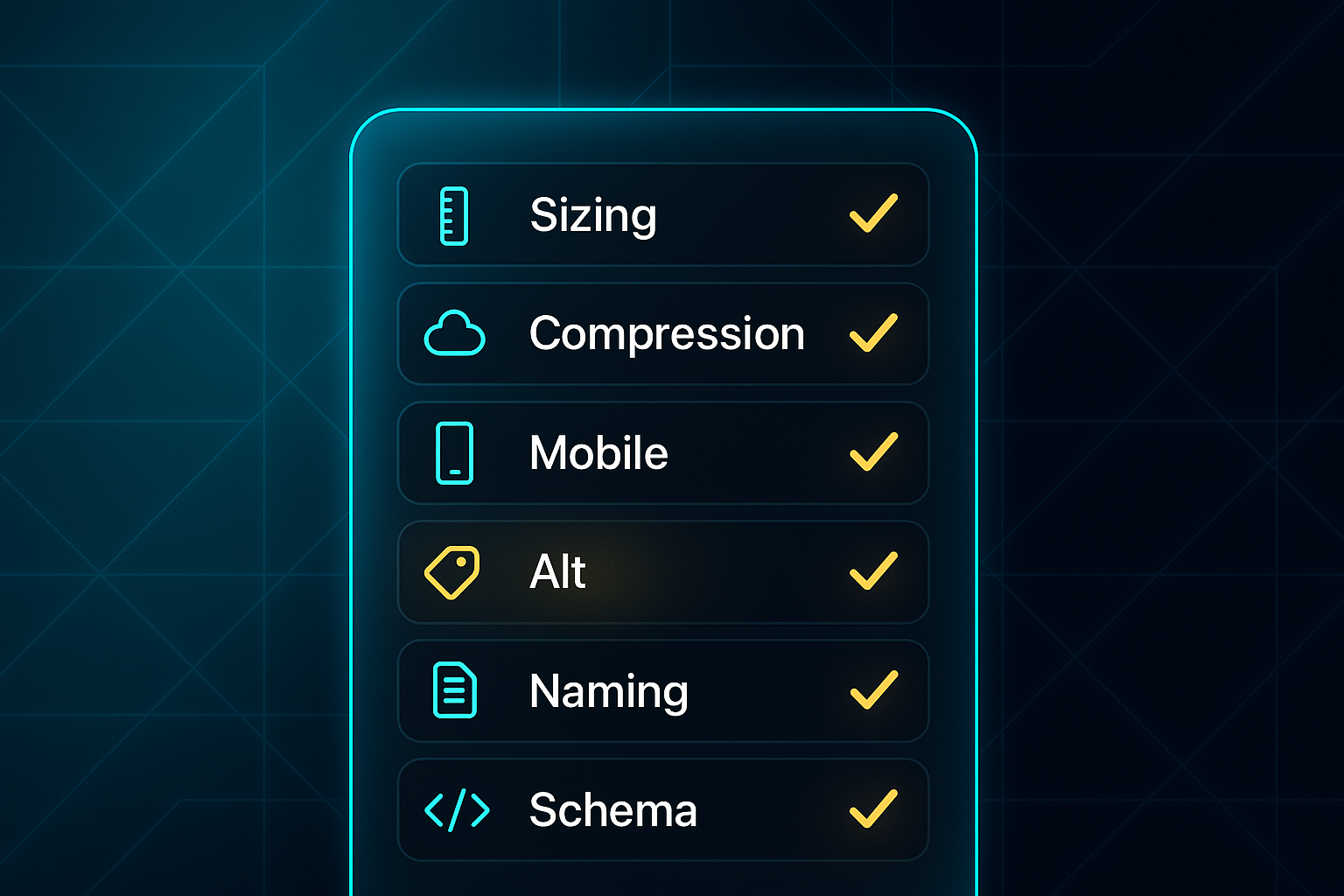
Before pushing “publish”, run your infographic past this scan—these core checks ensure you don’t lose out on SEO gains. Check these points before publishing:
- File name
Keyword-rich, descriptive—avoid generic names (e.g., "link-building-2025.png"). - Alt text
Uses main keyword, under 125 characters. - Schema markup
ImageObject schema for rich results. - File size
Compressed below 200KB (WebP/AVIF). - Blog embed
Within a 1,000+ word optimised post. - Relevance
Fully matches topic and search intent. - Contextual copy
Text explains or supports infographic data. - Branding
Logo present but not dominant.
Transformation in practice: before & after
Let’s see how each approach plays out for SEO and visibility—here’s a side-by-side comparison:
- Social infographic
Large logo, minimal text, JPG format, no schema. - SEO infographic
Subtle branding, keyword caption, text context, compressed PNG/WebP, schema applied.
If your infographic misses any audit step, tweak and audit again.
Get these details right and you’ll set your blog up for reliable rankings and better backlinks.
Ethical and legal essentials for SEO infographics in 2025
Creating SEO infographics in 2025 isn’t just about design and data—it’s about hitting strict legal and ethical standards that protect your blog and your reputation.
To keep your visuals compliant and your site safe, here’s what you need to focus on:
- Commercial Licensing
Use only images or icons with valid commercial rights—CC BY, CC0, or direct purchase. - Attribution
Add visible credit on the image (12px, lower-right, high-contrast) and a linked attribution below. - Accessibility
Alt text (≤125 characters), 4.5:1 colour contrast, and 16px+ fonts are required to meet WCAG 2.2 AA and ADA. - AI Image Protocols
Record prompts, verify platform copyright permissions, and add disclaimers if US/EU law demands. - Ownership Marking
Watermark (semi-transparent, bottom-right) and embed author/site details in metadata for link reclamation. - International Use
Confirm open/government data is cleared for blogs and adjust attribution for local law. - Record-Keeping
Keep logs for all licences, permissions, and metadata to stay audit-ready.
These steps give your blog real staying power—helping you avoid legal headaches and supporting global SEO visibility. It’s a bit of extra work, but in 2025, a little preparation goes a long way.
Crafting Effective CTAs for SEO Infographics
The right call-to-action (CTA) transforms your infographic from eye-candy into an SEO asset. CTAs guide readers to interact—whether that’s sharing, downloading, or exploring more—which means more engagement, backlinks, and conversions for your blog.
Let’s break down the top CTA strategies for SEO infographics, so you can mix and match based on your goals:
- Share Button/Embed Code
Place visible share buttons and an embed code nearby—these multiply backlinks and help control your attribution. - Download Option
Add a “Download as PDF” button to let users save or share, growing your email list if gated. - Related Content Link
Feature “Read next” or “Explore more” to boost internal linking and keep readers engaged. - Conversion CTA
Use buttons for “sign up,” “download,” or newsletter opt-ins to capture leads.
Regardless of the CTAs you use, to maximise results, make sure they are large, high-contrast, clearly labelled for screen readers, and keyboard-friendly. Split-test “Download Tips” vs “Get the PDF” with A/B tools to see what resonates most.
Need an easy setup? WordPress plugins handle no-code CTAs, while custom HTML/CSS fits unique branding. Track clicks in GA4 analytics to see which CTAs earn the most engagement.
Ready for the next step? We’ll pull these tactics together into a repeatable workflow you can apply across all your future infographics.
Making Your SEO Infographic Truly Stand Out
Most bloggers underestimate just how much a single, well-optimised infographic can move the needle for rankings and engagement. The difference isn’t just in design—it’s in the details: keyword-rich alt text, schema markup, fast load times, and strategic placement above the fold.
If you want your next infographic to actually drive SEO results, here’s my advice: treat it like a campaign, not an afterthought. Start with a clear topic and SERP analysis, build for mobile, automate your technical checks, and always track performance with GA4 or Hotjar. Don’t skip outreach—embed codes and share buttons turn visuals into link magnets.
SEO infographics aren’t a shortcut, but they are a multiplier. When you combine smart optimisation with consistent measurement and promotion, your blog doesn’t just get noticed—it gets remembered. The blogs that win in 2025 are the ones that treat every infographic as an asset, not an accessory.
- Wil